
Bi+ Symbols Throughout History
When we say ‘throughout history’ we really mean ‘since the 1970s, ish”.
Until bisexuality emerged as a separate identity, the symbols used by people who might today identify as bi+ were the same as those used by gay people. The green carnation, popularised by Oscar Wilde, was used in the late Victorian period, and rings worn on the little finger for men and the thumb for women became a popular method of flagging your queerness in the second half of the 20th century (although people who were there will tell you that we were never entirely sure whether it was just an urban legend or joke and which hand was for whom). In the 1970s a single stud in the right ear was used as a signifier too (same), and interlinked double Venus ♀ or Mars ♂ symbols were used in graffiti and print media. Shades of purple have been used in a number of queer symbols, from the earilest days of the movement (see the purple handprint used in 1969 and the lavender rhinoceros created by Boston, Mass. artists, Daniel Thaxton and Bernie Toa in 1973)
The Greek lowercase λ (lambda) was adopted as a symbol by the Gay Activist Alliance in 1970 and was quickly picked up by other groups. In 1974 - four years before Gilbert Baker’s rainbow flag - it was adopted as the official symbol of the gay and lesbian rights movement at the International Gay Rights Congress, that year held in Scotland.
Bi+ symbols have gone on a similar journey. From planetary icons to flags with a sprinkling of If You Know You Know images that gave plausible deniability in difficult situations, we’ve embraced hundreds of varients of dozens of symbols. This is where they began.
Widely Adopted Bi+ Symbols

1970s: interlinked gender symbols
The astronomical symbols for Mars (♂) and Venus (♀) date at least to the high middle ages Byzantine Empire, but they wouldn’t be used to denote sex (in biology and botany) for around 600 years. Dutch biologist Carl Linnaeus introduced the convention in the 1760s in his works taxonomising plants.
The symbols are now most linked in the popular imagination with human gender and since the 1970s interlocked pairs or groups of the symbols have been used by queer activists, with ⚢ and ⚣ denoting gay men and lesbians respectively. Bi+ sexualities could be denoted by any combination of three or more symbols, making them infinately customisable.
The interlinked astronomical symbols are still in use today, with some later iterations replacing the overlapping circles with the mathematical symbol for infinity (∞) to emphasise the full spectrum of gender.

1985: bi-angles
While the use of the overlapping gender symbols was inevitable in the context, the bi-angles were an intentional symbol created to highlight the bi+ experience. The original artwork was painted by Liz Nania in 1985, taking the commonly used inverted triangle, a symbol used by the Nazis to identify gay men (and bi men and trans women) in concentration camps that was undergoing a reclamation in the USA and added lavender, then more strongly associated with the phrase ‘Lavender Menace’ than today, and blue, which when paired with pink represented traditional gender roles and supported the lavender to imply the liminality of bisexuality.
By 1987 it was being used as a motif on BiNet USA merchandise and by a number of regional North American groups, and by the turn of the century it appeared on many of the earliest bi webpages.

1998: double crescent moons
Though common In the US, the inverted pink triangle was less popular in Europe. The Nazi atrocities that the symbol referenced were still in living memory and the reclamation of the symbol was - and by some still is - considered tasteless at best and extremely offensive at worst.
In 1998 Vivien Wagner devised a symbol that tipped its hat to Gilbert Baker's 1974 rainbow flag by including a rainbow gradient but took the form of two mirrored asymmetric crescent moons, inspired by the central third of the interlinked gender symbols. The motif spread throughout Germany. The rainbow was important to Wagner. She later said, ‘The rainbow colours of the crescents are intended that way. This is about solidarity with those that have HIV,
and those that are affected by Aids. It also serves as a symbol of our belongingness to the lesbian-bi-gay community.’
Michael Page's bi pride flag reached Europe, via Reykjavík pride, in 2000 and before long the colours of the new flag had been incorporated into the double crescent moons. In 2010, Frank, one of the editors of Bijou magazine (published by BiNe bV) proposed internationalising the double crescent moons by incorporating the magenta/lavender/royal blue colour scheme officially and today the original rainbow version is rarely seen.

22 March 1999: the bi pride flag
In the late 1990s BiNetUSA (then eight years old but with roots in the mid 1970s) was keen to introduce a bi pride flag. They wanted, said Wendy Curry, then president, “a symbol they could rally behind”, and Michael Page gave them just that.
The bisexual pride flag, comprising three bands in a ratio of 2:1:2 of magenta, lilac and royal blue was widely anticipated by the community, with Fritz Klein himself writing about it in BiNetUSA’s 1998 Winter Newsletter. Officially launched at a rally for Equality Begins at Home in Tallahassee, it travelled widely, and was spotted at a Mardi Gras in March 2000 and at World Pride in Reykjavik, Iceland in August 2000.
Representing homosexual attraction, heterosexual attraction, and the melding of the two, the colours of the bi flag have become symbols of the movement by themselves, no longer tied to the rectangular shape to be recognisable.

Early 2000s (we think): the pansexual astronomical style symbol
Combining Mars and Venus and incorporating a letter P (or potentially the ♇ Pluto glyph), this symbol is not an astronomical one but is specifically designed to resemble one. The design references the trans symbol (⚧) originated by Holly Boswell in 1993 to emphasise gender inclusivity.
Older members of the Biscuit team are convinced they started seeing this somewhere between 1998 and 2008, but there’s little reliable information online.

2010: the pansexual pride flag
Posted to their tumblr blog in 2010, Jasper V designed the most famous version of the pansexual pride flag, and in just a few short years became widely used. Spreading throughout tumblr and then on to Twitter and into the wider online world, the pansexual flag grew in popularity and usage much quicker than any symbol prior, a sign both of how much it was embraced and how much social media has changed our landscape. Though several alternative designs have been put forward (since around 2019 mainly) none have caught on.
The pink stripe represents attraction to woman-identified people, the blue to man-identifed peole and the yellow to nonbinary, genderqueer and others who identify outside of the gender binary.
Slightly Less Common Symbols
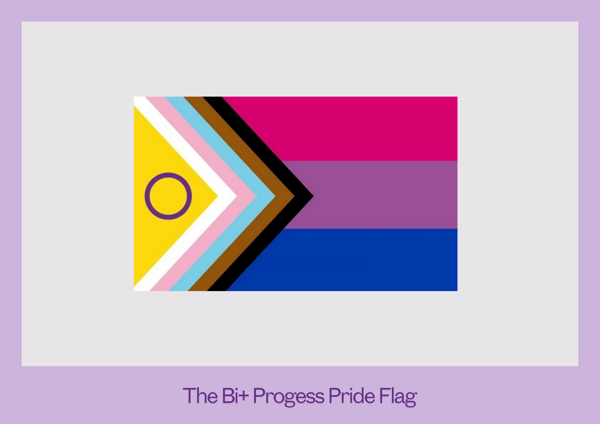
2021: The Bi+ Progress Pride Flag
Starting in late 2020, some members of the active London bi+ community were looking for a symbol that recognised the intersectionality of our community. Several designs were proposed, but none captured the essence that was required.
In 2021, Valentino Vecchietti released her intersex inclusive rainbow flag, and it was decided that rather than reinventing the wheel, tweaks would be made to the existing bi flag, and Vecchietti’s chevrons added.
Thus, with a wider central purple stripe to emphasise the breadth of gender and gender presentations in the bi community, and the chervrons referencing the trans
community, people of colour and victims of the aids crisis and the triangle taken from the intesex pride flag, the flag was released firstly on to Twitter.
The group that had worked on the redesign chose to remain anonymous, believing the flag belonged to us all, and claiming authorship would be counter to that.

2012: The Polysexual Flag
One of four Tumblr orignating flags here, the polysexual pride flag was first posted to the blog fuckyeahpolysexuality in July 2012 by a user under the name of Samlin.
Working from the existing bi+ flags, Samlin said, “I made it similar to the bi and pan flags, since they’re all in under the multisexual umbrella” so (like in the pansexual flag), pink and blue represent attraction to women and men, and green replaces yellow as representing nonbinary genders.

2015: The Omnisexual Flag
Working inwards, the outer light pink and light blue represent the ends of the gender spectrum, the pink represents attraction to femininity and women, the blue represents attraction to masculinity and men and the dark purple represents attraction to nonbinary genders.
The flag was designed by tumblr user pastelmemer at the request of another, unknown, user.
Pastelmemer later said, “The colours were meant to complement each other rather than have specific meanings individually - it was meant to be evocative of the bi flag but have more colour variety, and the dark stripe in the middle was meant to show the infinite potential depth and complexity of […] identity”.

2013 or 16: The Abrosexual Flag
Co-designed by an anonymous tumblr user and pride-color-scheme in 2016, the colours of the abrosexual flag were not originally ascribed meaning, though it’s notable that this flag does not contain blue and therefore does not (accidentally or intentionally) reference the gender binary.

2001: Mexican Bisexual Pride Flag
Francisco Javier Lagunes Gaitán and Miguel Ángel Corona, Mexican activists involved pride organising as well as Aids and human rights work, designed this flag in 2001, and in it was officially adopted at Mexico City Pride on 29th June 2002.
The flag references the Mexican national flag, a tricolour with a central emblem. It’s made up of pink and blue vertical stripes on the outer sides, with a white central stripe and a purple trillium in the middle. The colour scheme echoes the Michael Page bi flag created just four years previously.
The trillium (see below) was on the rise in 2001, and it’s
inclusion here is the only example of it being officially used.
Over recent years the Mexican bisexual pride flag has fallen out of favour as queer people in Mexico seek the unity of a single symbol - Gilbert Baker’s seven stripe rainbow flag.
Other Symbols

Hydrangea
Most plants are bisexual, if only in the botanical sense, but the hydrangea is especially so because they can produce pink, purple or blue blooms. Because the colour of the petals depends on the acidity of the soil the hydrangea is growing in, they can be manipulated by altering the soils ph level.
That means, like bi+ people, hydrageas are viewed one way or another based on factors outside their control.
Their colouring makes them a subtle signal, making the hydrangea the choice of the discreet bisexual.

Trillium
A member of the lily family. Michael Page, the designer of the bi pride flag, suggested the trillium as a symbol of bisexuality in 1998 or 99. Potentially because of its triangular shape (like the then common bi-angles) and because of the plants botanical bisexuality, and while it did see some use, it didn’t catch on outside of the Americas.
In 2024, a slight resurgence took place, powered by social media. This has involved a tendency to overstate the prevalence of the symbol.

Unicorns
Originally a dismissive term making a joke at the expense of the heterosexual couples who sought ‘no strings’ sexual encounters with bisexual women who they prefered would not bring any of their own needs to the bedroom or expect an emotional or social bond. Called ‘unicorn hunters’ because of the rarity of their ideal woman, the term references the mythicality of the unicorn.
Used as a label both ironcially and in a reclaimed way, images of unicorns are often used as a subtle nod to bi+ sexualities when being overt isn’t what you want. Community groups that hold events in public often use a unicorn ornament or plush toy as a signal to newcomers that they’re in the right place.
When Bi Pride UK, the UK’s registered charity for the bi+ community, launched their own magazine in 2019 they called it Unicorn, drawing on the positive associations of mythicality: power, individuality and strength.

The Bonobo
The animal kingdom provides countless examples of bisexual behaviour in creatures from the sky, the water and the land. Much of what we know about these animals comes from fairly recent scolarship, but even in the 1990s the bonobo’s reputation was established.
The great ape, which is known for its notable socio-sexual behaviour (and which incidentally inhabits the genus Pan) is associated with bisexuality because it is thought to embody the bi stereotypes of nonmonogamy, increased sexual drive and disregard for gender.
Recent scolarship on bonobs suggests they’re not as
promiscuous as had been thought, another thing they have in common with bi+ people.
Pandas, on the opposite side of the coin, have been known to engage in bisexual behaviour, but are also famous for being very bad at courting sexual partners and engaging in sexual activity. The now defunct activist group London Bi Pandas chose their self-deprecating name based on this association.